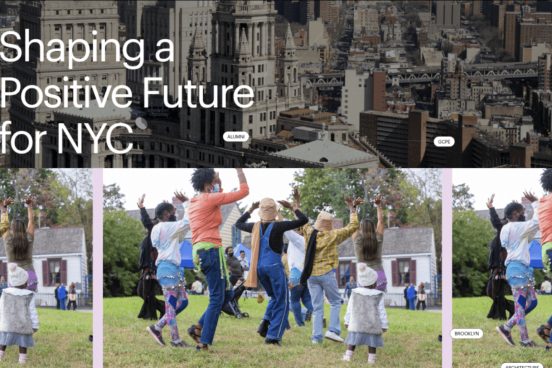
Pratt Institute relaunched its website in the summer of 2022 with a brand new visual direction. The site acts as a recruiting tool to inform prospective students about the programs and subsequently encourage them to apply to Pratt. While the new site displays attractive imagery and interactive features, stakeholders were concerned that users might have difficulty using this new site to apply for the programs. Our research team focused on Pratt’s desktop site and identified four main usability issues through the lens of moderated eye-tracking research. The solutions we proposed will potentially help increase the discoverability of crucial information and reduce misleading CTAs on the site. By doing so we hope to help prospective graduate students apply for desired programs more efficiently.

