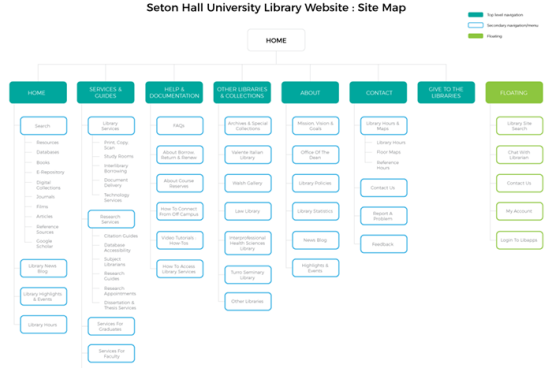
As part of a course project to redesign the Seton Hall University (SHU) Library website, this group of students aimed to make the site more intuitive and easy to navigate. Based on research involving various user groups (such as students, faculty, administrators), the team’s final design proposal featured a highly visible single search bar for both library resources and the website, prominent display of library hours, an easily accessible main navigation with comprehensive drop-down menus, and clear distinctions between clickable and non-clickable content.
