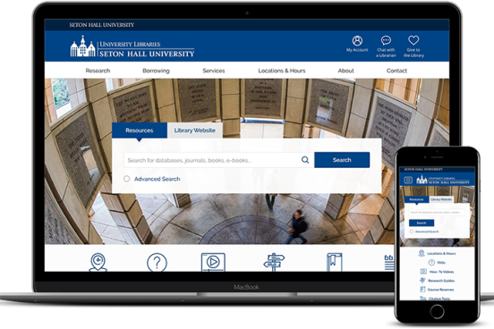
Seton Hall University Library was interested in re-designing their website on both desktop and mobile, with an emphasis on helping undergraduate students. This design team focused on three key findings from user research: (a) users have poor understanding of the library’s services offerings, (b) easy access to library resources is key, and (c) a tabbed search bar is confusing. Their final design proposal featured a persistent “help from librarians” box, an integrated search bar, more detailed information about library services, a more subtle implementation of chat, and abundant access to resources.
